The Dove of Peace: Art Movements and Visual Re-Thinking
This post is a continuation of my effort to shed more light on the Art-for-Peace Handbook, a project which I had a pleasure of collaborating on with two peace enthusiasts Olesya Geraschenko and Olga Zeleniuk. As I said in one of the previous posts, my job, among other tasks, was to develop visual artistic exercises, which would allow the readers/creators to connect in practical ways the discussions on peace, visual art and visual art for peace. Besides a re-make of Picasso’s “Guernica” and a number of other exercises, I developed an activity based on the image of dove of peace.
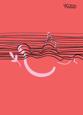
The activity presents eight versions of the dove of peace, all in the styles of different art movements. They are preseted below. Perhaps, an explanation of the doves in symbolism and minimalism would benefit the readers. A symbol of the dove as a symbol of peace, I thought, would be the olive branch. As for the minimalistic version, no dove is needed in the picture itself - the traces are enough. Those working with the Handbook then have a white space to draw their own vision of the dove of peace.
 |
| An op-art version of the dove of peace. |
 |
| A surrealistic dove of peace |
 |
| A symbolic dove of peace. |
 |
| A minimalistic dove of peace. |
 |
| A cubistic dove of peace. |
 |
| A hyperrealistic dove of peace. |
So what is the significance of the exercise? For
the Handbook, we assume that those potentially working with it would not
necessarily have any prior knowledge of the arts or of discussions on peace and
conflict, let alone of connections between art-making and peace work. So we
start from what could reasonably be identified as the beginning of peace acquiring
recognizable visual expression.
It is challenging to trace when exactly the
dove of peace came to symbolize peace. There are biblical references to the
dove in the story of Noah and the great flood, where the appearance of the bird
with an olive leaf signifies the end of the flood (The History Press). In the culture
of ancient Japan, the dove symbolized the end of war (note: this is different
from the beginning of peace). Interestingly, the dove did not bear an olive
branch or leaf – it carried a sword (The History Press). The dove was reaffirmed as the modern symbol
of peace by Pablo Picasso, when his artwork Dove
became the symbol of the 1949 Paris Peace Congress (Tate). Picasso created many
pieces of art featuring the dove.
Within the Handbook, I wanted to give those working with it the chance to explore their own vision of peace through a series of exercises. In the case of the dove exercise, I wanted to highlight – through experimenting with the visual styles of different art movements - the idea that peace may look differently to different people at different times. And the white space for own dove art is meant to encourage independent thinking and independent artistic creation on the part of those working with the Handbook. While creating an alternative to the typical image of the dove of peace (although variations are easy to google up), one works with shapes and with colors. So I decided to think how shapes and colors could relate to peace work.
Thinking about shapes, I recollected the
experience of going to art classes every afternoon for years of my life from
childhood to teenage times. The artistic training and practice of depiction –
quite often of real objects and spaces – made me notice and remember the
outlines and proportions of almost everything I saw. Changing the outlines and
proportions of elements of or entire things required having analyzed the realistic
shapes. So, through the dove exercise, I hoped to encourage an analysis of
elements of peace in the (visual) environments of those working with the
Handbook.
And thinking about colors, I remembered the
example of application of color which partly inspired me to create Color UpPeace (see the previous post).
Colors can also be used to accomplish things –
they can be used to contribute to peace.
In their work Making Peace Visible:
Colors in Visual Peace Research, Juha A. Vuori, Xavier T. Guillaume and Rune
S. Andersen (2020) explore how peace is made visible through coloring of
objects and symbols, which, if colored differently, would not be associated
with peace. One of the examples the scholars analyze is that of the blue berets
which peacekeepers normally wear: “to wear a blue helmet redefines a soldier’s
function from a modality of destruction to a modality of protection in a zone
of conflict” (p.60). Colors thus show their performative function: they do not only
symbolize peace, but also are used to enact it.
Of course, in the examples above colors do not act by
themselves – they are used by individuals in certain contexts to achieve
specific tasks. At some point, then, those individuals were trained on the
meaning of colors and their usage. The context of those working with the Handbook
is undoubtedly different from the context of the examples given above. Yet, practicing
how to use colors to express peace would be a valuable experience – at least I
thought so when developing the exercise. And what do you think? It would be
great to hear or read your thoughts in the comments!
This is what the exercise will look like to those working with the Handbook:
Attribution for the poster frame &
background: <a
href='https://www.freepik.com/free-photos-vectors/background'>Background psd
created by rawpixel.com - www.freepik.com</a>
Bibliography:
P.Picasso.
Dove. Tate. Retrieved from
https://www.tate.org.uk/art/artworks/picasso-dove-p11366#:~:text=Picasso's%20Dove%20became%20a%20symbol,Spanish%20word%20for%20'dove'.
Pater, R. (2016). The Politics of Design: A (Not So) Global
Manual for Visual Communication.
The History
Press. Peace Symbols through History. Retrieved from: https://www.thehistorypress.co.uk/articles/peace-symbols-through-history/
Vuori, J.,
Guillaume, X., & Andersen, R. (2020). Making peace visible: Colors in visual peace
research. Peace and Change, 45(1), 55–77. https://doi.org/10.1111/pech.12387
To see more of my art and design pieces, check the following:
1. My art Facebook Page:
2. My Behance
3. My Adobe Portfolio


Comments
Post a Comment